
These are the images that I have chosen for my final images.
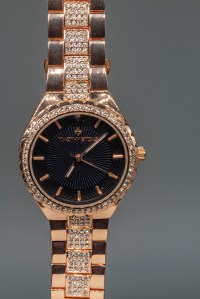
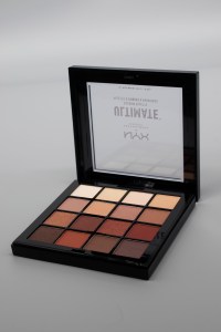
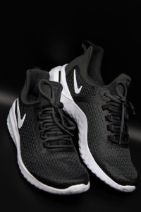
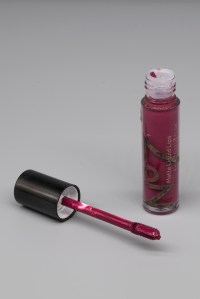
- Row 1: Objects of Desire
- Row 2: The Enigma of Time
- Row 3: The Constructed Image
I chose these images because I feel that they are the four most successful images from each category, and that they all have high impact. I decided to stay away from strict themes this semester to allow myself to experiment widely with different photographic processes and techniques, and avoid repeating images from the same shoot. I think that I have a wide variety of commercial photography, location shooting, studio shooting, night time photography, and two photographic processes (multiple exposure and photomontage) that I have discovered and expanded my skills with during this module. I had never shot multiple exposures before and found this really fun to experiment with. I also found creating digital collages was fun as it takes me back to my studies in Graphic Design, and it felt great to incorporate both my interests into my projects. If I could change one thing it would be that all the images in a set were in the same orientation (e.g all landscape, portrait or square) rather than mixing within a set, however this was beneficial for my images to remove unwanted distractions or white space.
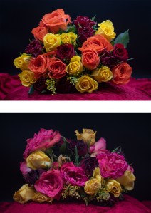
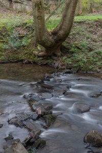
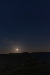
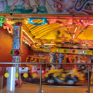
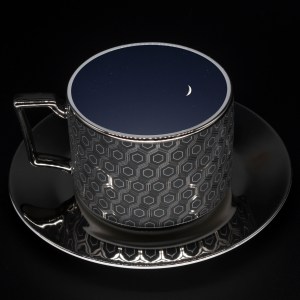
The printing process was quite straightforward as I had remembered what to do from last time. The papers I used were A4 FB Royal Gloss 310gsm which I used for most of my images, as I really liked the glossy appearance and the way it makes the colours really bold and punchy. I also used A4 FB Matt 285gsm for a couple of images; the Blackpool multiple exposure and the long exposure of the river; because the matte finish gave a calm feel to the images and colours, which is already expressed in each image. I tried printing the image of the stars and the ageing flowers onto matte paper, but the results were terrible and unflattering as the colour gamut wasn’t as broad and the blacks were very dark and didn’t mix well with brighter colours. I then printed them onto glossy paper and they were much more effective and closer represented what was on the screen. I was unsure whether to use the image of the stars with a warmer or cooler colour temperate, so I printed both to see how they turned out. The one with warmer, orange tones was full of noise and of low quality, whereas the one with cooler, darker, blue tones was sharper, the stars were more visible and overall looked more impactful. I was advised by Dave that this is because orange is part of the red colour channel, which holds much more noise than the blue colour channel, which is why the level of noise and quality of the image varied so massively. Therefore, I kept the cooler toned image as my final print.
