Final Images and Printing Process

These are the images that I have chosen for my final images.

  • Row 1: Objects of Desire
  • Row 2: The Enigma of Time
  • Row 3: The Constructed Image

I chose these images because I feel that they are the four most successful images from each category, and that they all have high impact. I decided to stay away from strict themes this semester to allow myself to experiment widely with different photographic processes and techniques, and avoid repeating images from the same shoot. I think that I have a wide variety of commercial photography, location shooting, studio shooting, night time photography, and two photographic processes (multiple exposure and photomontage) that I have discovered and expanded my skills with during this module. I had never shot multiple exposures before and found this really fun to experiment with. I also found creating digital collages was fun as it takes me back to my studies in Graphic Design, and it felt great to incorporate both my interests into my projects. If I could change one thing it would be that all the images in a set were in the same orientation (e.g all landscape, portrait or square) rather than mixing within a set, however this was beneficial for my images to remove unwanted distractions or white space.

The printing process was quite straightforward as I had remembered what to do from last time. The papers I used were A4 FB Royal Gloss 310gsm which I used for most of my images, as I really liked the glossy appearance and the way it makes the colours really bold and punchy. I also used A4 FB Matt 285gsm for a couple of images; the Blackpool multiple exposure and the long exposure of the river; because the matte finish gave a calm feel to the images and colours, which is already expressed in each image. I tried printing the image of the stars and the ageing flowers onto matte paper, but the results were terrible and unflattering as the colour gamut wasn’t as broad and the blacks were very dark and didn’t mix well with brighter colours. I then printed them onto glossy paper and they were much more effective and closer represented what was on the screen. I was unsure whether to use the image of the stars with a warmer or cooler colour temperate, so I printed both to see how they turned out. The one with warmer, orange tones was full of noise and of low quality, whereas the one with cooler, darker, blue tones was sharper, the stars were more visible and overall looked more impactful. I was advised by Dave that this is because orange is part of the red colour channel, which holds much more noise than the blue colour channel, which is why the level of noise and quality of the image varied so massively. Therefore, I kept the cooler toned image as my final print.

Teacups and Saucers – VISUAL DEVELOPMENT – Constructed Image

My other main idea for the Constructed Images was to photograph a cup and saucer, and photoshop different elements inside the cup to create a collage/photomontage. My first idea was to photoshop one of my images of the stars and the night sky into the cup, so that it looked like the stars were filling it up. I had seen similar ideas on Pinterest that inspired this idea, but I wanted to personalise the items that I imposed into the cup. Another possible idea was to photoshop some of the landmarks and skyscrapers from my trip to New York into the cup, to appear like there was a city within the cup. Therefore I began photographing in my home studio again, with two different coloured sets of cup and saucers to see which was most effective. I shot them from various angles so that I had a wide choice of which images to impose into which cup; I also varied the lighting to find an effective lighting setup and found an appropriate exposure, which needed to change to the complete opposite once I swapped from the bright, white cup and background to the darker, silver cup with black background. Here are the images from the shoot:


The Editing Process

Next, I was tasked with editing the images on Photoshop to add in the elements that would produce the collage and turn the images into a Constructed Image. I imposed the stars into the cup by first drawing out an ellipse shape the fill the top of the cup, then placing another layer with the photo of the stars and creating a clipping mask to clip the photo into the correct circle shape. I then added another layer where I used “select and mask” to add a picture I had taken of the moon into the image, to add to the night sky element and add more layers to the collage. I chose the silver cup and black background because I felt this colour scheme was fitting with the dark night sky and bright stars.

I was so happy with this first image that I wanted to see what the New York teacup would look like, too. I used the “select and mask” method again to individually cut out the Statue of Liberty, Flatiron building and World Trade Centre and some surrounding buildings, smoothed the outline so that it looked more natural, and used the ruler guides to help me place them level with the top of the cup. The image has an almost surreal and pop art kind of vibe to it, which I think is really interesting and appropriate for a collage. Here are the final edited images:

Multiple Exposures in the Uni Studio – VISUAL DEVELOPMENT – Constructed Image

For the Constructed Image, I wanted to experiment with multiple exposures as I really like the effect they give with layering multiple images onto one frame. I wanted to do this properly and authentically by doing the exposures within the camera, rather than taking the easy route and merging two photos together on Photoshop post-shutter. I booked one of the studios at the university, with the lighting rig in H34, and took along one of my peers so we could experiment with the lighting, and also undertake some shoots for our assignments. I brought along my own camera, however this didn’t have the multiple exposure feature, and so I used the camera that came with the kit as this did have the correct feature. I set the camera to two exposures, used the light meter to set the correct exposure, and began shooting multiple poses to find the most effective combination for this process. I found that the first few images with the subject overlapping twice made the two images difficult to distinguish and kind of distorted the image, so this wasn’t successful. I then tried to get the subject in both halves of the frame, so that both images could be seen. Another trick we tried was a hair flick, to freeze the movement of the hair and overlap this with a static image. I think the most successful images are the ones towards the end of the contact sheet, where the subject appears in both halves of the frame with effective postures. The one labelled “Multi exposure 2 contrast.tif” is my favourite at this point as the subjects eyes can be seen on both sides and this creates a connection with the viewer.

Screen Shot 2019-04-07 at 22.54.32


Intrigued by the process and results of multiple exposures, I also decided to experiment with a couple of pictures that I took in Blackpool. I imported the two candid pictures that I took, similar to the style of Martin Parr, into Photoshop and changed the opacity so that one image overlapped the other, with both of them still being visible. I tried both ways around with one image on the top layer and one on the bottom layer, then vice versa, to find the most effective composition. I also altered the opacity percentage to find the most effective setting. Combining the images adds to the juxtaposition of the family area of the arcade vs. the adult, gambling side. This was the result:

Constructed 2

Commercial Photography – VISUAL DEVELOPMENT – Objects of Desire

IMG_2204 

The commercial photography and shoots for the Objects of Desire assignment have all been taken in my home studio/tent, pictured above. It has two LED lighting bars at the top that can be moved around as desired to light up the subjects, with reflectors on the inside to bounce the light around effectively. I have found this really effective when taking high quality photographs with simple, non-distracting backgrounds.

After being inspired by Wilson Hennessy and Richard Maxted, as well as the advertising material seen in our everyday lives such as on TV and on billboards, I set my studio up and considered what desirable objects I had to photograph. The first item I wanted to shoot was my watch, as this is a classy accessory that is often shot for commercials with high impact images, high quality lighting showcasing all the details and materials, and striking backgrounds and colour themes. I tried to recreate this by using a subtle grey backdrop, which complimented the rose gold colour well. I varied the lighting throughout the shoot to illuminate the watch effectively without any reflections in the glass, and experimented with a variety of angles. To get the straight on view of the watch, I hung it from the lighting with a piece of thread to hang it vertically so it was easier to photograph and it gives the appearance of the watch floating in mid air, without any visible props in the frame.

Next, I used an eyeshadow palette as my next subject; it was brand new and in pristine condition, so I thought it would be ideal for a commercial shoot, as I have been advised before the objects in these shoots have to perfect, with no imperfections, to make the images effective. I also varied the angles and lighting with this shoot, to illuminate the colours of the makeup, while also effectively lighting up the case so the wording was visible, but without getting any unwanted reflections in the window. I began by using a zoom lens that I purchased at the recent Photography Show event, but because it was new and I haven’t yet had much time to use it, I found it difficult to focus the image and so went back to my standard kit lens, which proved very effective at capturing all the details. I also experimented with placing the eyeshadow brush in some of the images to see if this added to the image; I thought this looked successful but annoyingly the background was imperfect in some of these images.

Lastly, I photographed another makeup item, some lipstick. The idea of using makeup was that it is highly desirable for many women, and even some men these days, and is also a popular item to be shot for commercial purposes in a studio. The colours that I had were quite bright and gave interesting colour schemes in my images. I chose a white background for the makeup because the bright colours and black packaging contrasted strongly against the background, making the subject stand out. I used my tripod and shutter release cable for all three of the subjects to ensure crisp and sharp images with minimal camera shake; having the images in focus is critical for commercial photography. I really enjoyed photographing in the studio and seeing firsthand how professional lighting can really enhance an image.

Richard Maxted – RESEARCH – Objects of Desire

Richard Maxted specialises in still life commercial and advertising photography; his controlled use of studio lighting is an art form in itself. He graduated with a degree in Photography from Blackpool College in 1995, before opening his own east London studio in 2000. He quickly established himself within the industry, and his eye for detail and obsession with ‘getting it right’ earned him respect and admiration from his peers. He has worked for clients such as BA, RBS, V&A, Jim Beam, Campbells and Mandarin Oriental. His images mostly feature solid, single colour backgrounds that compliment the subject while still keeping the focus of the image on the product being advertised. The studio lighting illuminates the items beautifully while creating the occasional shadow or reflection, all artistically placed and well thought out. His subject matter varies widely from technology such as watches and cameras, to flowers and books which are both composed of organic matter. Strong studio lighting and plain, simple backgrounds seem to be common themes within still life photography, and I will carry this across into my images. I aim to create something similar to Maxted and Oprisco.

“Your personal work identifies who you are as a photographer. The ads and commercial work are the proof you can do the job, but personal work shows your eye, shows what you see and what makes you tick…”

– Richard Maxted

Long Exposures of the Stars – VISUAL DEVELOPMENT – Enigma of Time

Another idea I had was that I could show the effect of time in my images by using the most important tool I already had – my camera! The longest exposures I had done so far were those of about 5 seconds of the moving water in the last shoot, but I wanted to challenge myself even further by trying to capture the stars in the night sky. I knew that this would involve a much longer shutter speed and of course my tripod, and that maybe it was a big challenge with a chance of failing, but nevertheless I wanted to give it my best shot, and I had always aspired to take beautiful photographs of the stars and the wonders of nature!

I did my research before the shoot and found out that an exposure of around 20 seconds or more would be ideal to capture the light coming to earth from the stars. With this in mind as a starting point, I was then able to figure out the correct aperture and ISO based around this. I chose another local location called Tegg’s Nose, as I knew this would be the perfect place to access by car with a sturdy car park to place my tripod, and is probably the closest place to home away from the majority of light pollution and therefore safest to access in the early hours of the morning, when the sky would be the most clear and the majority of lights would be out as people slept. The biggest challenge I found during this shoot was focusing the camera; I experimented with both autofocus and manual focus, but it was impossible to find a star to focus on with my camera facing vertically upwards towards the sky, and the sky completely black on the viewfinder. To resolve this, I faced the camera towards the hills where I could still capture the night sky and the stars in the top half of the image, with some landscape and nature in the bottom half and the moon as my main focal point. This gave the images some foreground interest, adding depth and layers so there are more elements for the viewer to see and keep them intrigued. Although most of my images were out of focus, it was fun to keep experimenting and figuring out how to resolve the issues that I faced. I attempted to use the car headlights and the torch on my phone to find a focal point, but unfortunately these did not work. Next time I would take along a speed light to illuminate the elements in the foreground. I was also advised by Dave while editing and printing post-shutter that the gradual change in colour along the horizon line was in fact caused by light pollution from the nearby towns and city of Manchester, and that the reason the printed versions with an orange/red colour temperate were of poor quality with lots of noise, was because the red colour channel holds more noise. Whereas the prints with a blue colour temperate were a lot clearer with vastly reduced noise, because the blue colour channel does not hold noise in the same way. This was very useful knowledge to apply to the printing process and any future shoots of this nature.

Ingersley Vale – VISUAL DEVELOPMENT – Enigma of Time

Next, I wanted to try photographing moving water again for this assignment, as I really like the white, ‘cotton’ type effect that is produced when photographing moving water with a slow shutter speed, and one of the main areas of photography that interests me is landscapes and nature, therefore I wanted to improve on my last attempt.

This time I took a walk in my local town of Bollington in search of a river called Ingersley Vale and the waterfall that I had read could be found up there. I thought that this could be a wonderful photo opportunity, especially now I had learnt the importance of a tripod when shooting moving water and how it would give me a clean, crisp background in the areas with no movement, as hand holding would not be sufficient enough. Walking along the path, I found a “waterfall” but with nothing more than a trickle of water! And so I continued my walk to find something way more powerful; later coming across the vale and the river flowing through the luscious green Cheshire fields. I set up my tripod near the bridge as this was where the water seemed to be flowing the fastest, and I thought the bridge could also become an interesting element in the images. I experimented with shutter speeds between 3 and 5 seconds, way longer than the 1/8th of a second that I tried using on my first shoot in Eyam. This gave me much more motion blur in the water, closer to the effect that inspirational photographers such as Liza Dracup had achieved in their work, which is what I was after. I experimented in different points along the river to find the most successful place, incorporating the trees, bridge and surrounding nature to add more depth to the images. My images are below:

Liza Dracup – RESEARCH – Enigma of Time

“Dracup is well versed in the history of photography (and the history of art) and subscribes to a different conception of what the camera can do. Her pictures – photographs seems too narrowly descriptive a word for them – are not about capturing a particular moment in time but about timelessness. Her focus is less on something fleeting … and more on the long afterlife of places, plants and animals.”

– Michael Prodger

Landmarks exhibition catalogue
Mercer Art Gallery Harrogate 2016

Liza is a landscape photographer whose work draws on the British landscape, often focusing on the distinctiveness of the woods, rivers and wildlife of West Yorkshire where she grew up. Her photos place an emphasis on the extraordinary properties of the ordinary, and reveal hidden or unseen aspects which lead to a more informed, comprehensive and enriched idea of the northern landscape and its history.

In her series Sharpe’s Wood, the images are only shot between the hours of sunset and before sunrise, which enables them to capture the very essence of photography – time and light. Since the human eye cannot see very well in the dark, Liza uses the camera to “make the invisible visible” and this becomes our tool for seeing in the dark, as the camera understands more than us about light, or the lack of it. The actual location of the woods isn’t as important – they could be any woods, anywhere in the country, and our own sense of memory will determine how we respond to the images, dependant on whether we are familiar with the location or not.

Chasing the Gloaming (2011) is a series she produced in response to the moonlit oil paintings created by legendary artist of the Victorian era, Atkinson Grimshaw. The images depict rivers, woodlands and the Yorkshire coast as places that are ethereal and otherworldly, thanks to the use of the fading light that comes just after sunset and just before dark.

Funfair – VISUAL DEVELOPMENT – Enigma of Time

A few days after the Blackpool trip, a travelling funfair was set up at my local train station, an event which happens annually and the children and adolescents in my town always look forward to it. I couldn’t believe my luck and thought this would be a brilliant opportunity to shoot the movement of some rides that I didn’t have chance to do in Blackpool! I decided to do the shoot once it had gone dark because the light trails would make the movement and the passing of time in the image much more prominent, in comparison to the photos I took in Blackpool in the daylight where the movement was more subtle in the image and may not be noticed in some of the images without being pointed out. Unfortunately luck wasn’t exactly on my side again, as the selection of rides was quite small and poor, with most of them being packed together so there wasn’t much room to get a good angle for the images, or there weren’t enough lights on the rides to visualise the movement and accomplish my vision. There was also a large police presence due to an incident with some adolescents, and so I had to keep my distance and shoot the tall swing ride that was there as the main subject. The event was popular with a busy main road located opposite, meaning it wasn’t safe to put up my black tripod in the dark, so I took some handheld shots and tried to make the best of the situation. The bright, colourful lights look effective against the black sky, however it was hard to capture the movement because I couldn’t lower the shutter speed enough to capture it effectively. It was however productive to try and shoot in low light conditions and helped inform me how the exposure must change in such conditions. With such little luck shooting rides and attractions, I decided it was time to photograph other subjects that may give me a more successful outcome.

Screen Shot 2019-04-07 at 17.12.22

Blackpool Shoot – VISUAL DEVELOPMENT – Enigma of Time

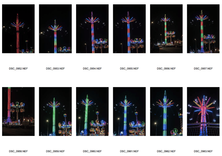
Myself and one of my peers were discussing our assignments and we both decided that Blackpool would be a brilliant location to take some photographs for The Enigma of Time assignment. With the seaside resort typically being very popular with tourists, we figured there would be many photographic opportunities to capture movement; my initials plans were to put up my tripod along the promenade and capture the many people walking along the seafront, with the camera on a slow shutter speed to achieve motion blur with the background staying sharp. I also wanted to capture similar images of the fairground rides and attractions in motion along the piers. Another reason for choosing Blackpool in particular was that we were both inspired and intrigued by the work of Martin Parr and his satirical images of working class people enjoying their holidays at similar seaside resorts, and we also wanted to capture the essence of British seaside resorts in our images and maybe even experiment with a similar documentary style to Parr.

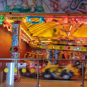
So on 18/03/19 we caught the train to Blackpool North station and embarked on our seaside photography adventure. Having kept an eye on the weather forecast the week before, we were disappointed to find that when we arrived it was raining – hard – throughout the entire day. This was concerning because we had planned our shoot and didn’t want to damage any of our camera equipment, but also because there was hardly a soul around or along the promenade, which was an essential ingredient for the images we wanted to capture! We decided to begin by exploring one of the indoor amusement arcades for photo opportunities while keeping ourselves and our cameras dry. As soon as we walked through the door of the well known Coral Island amusements, we were greeted with an ideal ride for me to photograph for the kind of images I was after. Although I was nervous to set up my tripod in a public place, I set up my equipment facing a children’s train ride which had an interesting angle as the train went up an incline in the track. I was conscious of appearing strange from photographing a children’s ride, but my intention was for the train to be considerably blurred so none of the children would be identifiable anyway, and would have explained this had anyone asked. Typically once my equipment was set up, the few families that were around had moved on and so I had to wait patiently for another person to board the train. During this time I took a few test shots to find the appropriate exposure and focal length. It was difficult at first to get the timing and focus right, but after a while I think I managed to get some successful images. The only downside was that surrounding the ride were lots of obstructions such as signs, other attractions and pillars within the structure of the building, and so when editing these images I made a tight square crop to remove any distracting elements in the foreground and ensure the viewer’s focus would be on the motion blur of the train. Once I was happy with my shots, we moved on around the arcade; I decided to try and capture the movement of a classic British arcade game, the 10p slot machine, but the movement of the tray of coins was only quite small and the images didn’t look particularly effective. Due to the small number of people that were around, not many of the other machines were in action or seemed like they would provide an effective image, and so we took a break to think about what to do next. During this time I took a moment to take in my surroundings and my thoughts turned to Martin Parr; a couple with a young child appeared nearby and I quickly took the opportunity to take a candid photo of them enjoying the amusements, improvising by using the top of the machine behind to keep the camera steady as I didn’t have enough time to set the tripod back up before they moved! I didn’t want to seem invasive and so I then turned around and saw another person playing on the slot/gambling machines towards the adults area, and quickly snapped a picture of that side of the arcade, too. Then I realised I had just caught two juxtaposed images – one of the family side and one of the adult side – and thought that this would be an ideal context for a constructed image/multiple exposure!

After visiting a number of other arcades that were either completely quiet or the rides weren’t suitable for an image, we took a walk along one of the piers to see if that area was any more lively. Unfortunately it was just as quiet, but looking over at the iconic tower, I noticed the road along the bottom and thought I could possibly capture an interesting image of the dominating tower, with the movement of the cars passing below it. And so I set my tripod up outside; the exposure needed to be completely different here as the sky was very bright and overcast, compared to the darkness of the arcade, and so I spent a while experimenting and trying to get the shutter speed right. I got the shots but from my position it proved difficult to get the road in a prominent position within the composition while also getting the tower in shot, and so the images don’t really point towards the intention of capturing the movement of the cars unless you look closely. I then tried to get another image of moving cars by pointing the camera towards the exit of the pier, where the road could be seen with a stereotypical sign featuring a donkey hung above the doorway, and caught a couple of shots of cars driving past, almost illustrating the people leaving the resort under the sign saying “thank you for coming, see you again soon!” With the elements being against us, this marked the end of our trip and any more photo opportunities; although the shoot wasn’t as successful as we anticipated, I have been able to practice using my equipment and capturing movement, become more confident with photographing in public, and caught a couple of images that I think could be effective with some editing post-shutter.

This slideshow requires JavaScript.


DSC_0905 square

Probably the most successful image from the shoot, with a tight crop focusing on the ride itself