This module is focused on the book titled The Photographer’s Eye by John Surkowski. The book outlines the 5 key characteristics that produce a successful photograph:
- The thing itself
- The detail
- The frame
- The time
- The vantage point
The thing itself (photographs) are different from reality – reality can be filtered, clarified or exaggerated and allows for the creation of fantasy.
‘The detail’ refers to the use of photography to capture things that are too ‘ordinary’ to paint; details can’t narrate but they are symbolic and evocative for the viewer.
‘The frame’ encourages the photographer to choose and eliminate the frame to focus on particular subjects. New relationships can be formed by isolating subjects from the background.
‘The time’ explains how photographs can only describe the present, at the exact moment of the ‘click’ of the shutter. Therefore, photographs will always be in the past when viewed.
Cameras allow for different vantage points to painting as they are more portable and a variety of angles can be taken by handholding a camera, rather than painting with an easel.
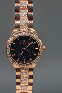
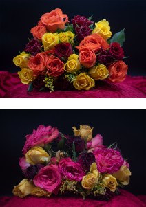
Project 1: Objects of Desire
Transform an everyday object into an ‘Object of Desire.’ This could be achieved by taking the route towards studio still life photography. A bigger light source will remove any unwanted shadows in these images.
Photographers:
- Richard Maxted
- Association of Photography (AOP)
- Simon Larbalestier
- Carol Sharpe
- Adrian Lyon
- Wilson Hennessy
- Tal Silverman
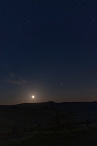
Project 2: The Enigma of Time
Use ‘time’ somehow in your images.
Photographers:
- Francesca Woodman
- Catriona Grant
- David Scheinmann
- Alexey Titarenko
- Michael Wesely
- Duane Michals
- Gina Glover
- Bill Brandt
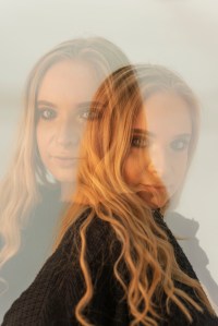
Project 3: Constructed Images
Construct images using any of the following:
- Multiple Exposure
- Multiple Printing
- Montage
- Image and Text
- Mirrors
- Layers
Photographers:
- Hannah Hoch
- Man Ray & Dora Marr
- Herbert Bayer
- John Stezaker
- Barbara Kruger
- Paul Hill
- Abelardo Morell
- Mindo Cikanavicius
- Zander Olsen
- Robin Maddocks
- Oleg Oprisco
- Gillian Wearing
- Loretta Lux
The History of Photography
There are various dates that contribute to the birth of photography. According to history books, photography began in 1839. However, it is said that Joseph Nicephore Niepce took the first photo that still exists back in 1827. Then, Hercules Florence first used the word ‘photography’ in 1832.
Prehistories
Among the first photographic processes were Paleoloithic cave paintings dating all the way back to 10,000BCE.
There are early written records of experiments with light and the Camera Obscura from 1,000BCE. Photographers such as Johannes Vermeer began using the Camera Obscura within their practice from 1,500BC.
70CE – Roman chemistry experiments.
1,100CE – The Alchemists used light to darken silver salts.
1,717 – Johann Schulze experimented with “fleeting sun pictures.”
1790 – Thomas Wedgwood experimented with the Camera Obscura and silver nitrate sun prints.
The Camera Lucida was invented by Dr William Hyde Wollaston in 1807.
The first photograph of a person was taken by Louis Daguerre in Paris in 1838, where a man is pictured having his shoes shined on the pavement next to the road.
William Henry Fox Talbot took his first image titled “The Oriel Window” in 1835, and created the world’s first photo book called “The Pencil of Nature.”
In 1847 the law in France considered photography as a ‘mechanical process’ and not art.
Up to 1851, the Daguerreotype was “the technology.”
Frederick Scott Archer provided the breakthrough in 1851: the Collodion glass negative, with the advantage of detail and speed.
Roger Fenton used the wet Collodion process and a portable darkroom in 1855.
In 1871, Richard Leach Maddox invented lightweight gelatine dry plates which were a revolution at the time!
Further research then lead to snapshot photography and the Kodak camera with roll film.
The Portrait
The literal definition of a portrait is: a drawing, painting or photograph of a person. A more accurate definition, however, would be: a representation of a person. Ask yourself: Does it simply record the outer surface, or provide insight into their character?
Cindy Sherman dresses up in various costumes and poses for her photos, frequently portraying female stereotypes found in film, television, and advertising. However she does not label these as “self portraits” because in that moment she is interpreting another person, not her genuine self.
Robert Cornelius produced the world’s first deliberate portrait in 1839.
David Bailey is another huge name in portrait and fashion photography, and is best known for his iconic portraits of artists, musicians and actors of the 1960s and 1970s, such as Andy Warhol and the Rolling Stones.
Other Portrait photographers include:
- Diane Arbus
- Garry Winogrand
- W. Eugene Smith
- Richard Avedon
- Philip Lorca DiCorcia
- Adrienne Norman
- Astrid Schulz
- Steve McCurry
- William Wegman
The Self Portrait
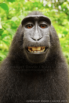
David Slater is a British wildlife photographer; he is most famous for his image of “the monkey that took its own photograph.” On a trip to Indonesia, he was following a group of Sulawesi macaques in the forest, in an attempt to connect with them and co-exist peacefully with them, while of course photographing them along the way. After a long day, Slater sat down close by to the group of monkeys for a rest, while they were having a group grooming session. Soon enough, the monkeys came closer and become grooming him too! They also took a liking to his camera and so the photographer placed the camera on his tripod with a very wide angle lens, predictive autofocus and a flashgun set, in the hopes of capturing a facial close up. His efforts were worthwhile as the monkeys began grinning and pulling faces in the lens of the camera, pressing all of the buttons and inevitably some photographs and “self portraits” were taken, including the iconic photo we now recognise today! However, his photo has caused Slater a lot of financial difficulty as he has been frequently dragged through the courts over the debate of copyright of the image; is Slater right to claim ownership of the image, or does the copyright belong to the monkey itself as he was the one who pressed the shutter?! This debate has opened up an interesting conversation about copyright and what is technically defined as a “self portrait.”
Francesca Woodman photographed herself in empty interiors, often nude or semi-nude, to portray her suffering with mental illness such as anxiety and depression. However, her pictures are not traditional self-portraits. In her images, she is usually half hidden by objects or furniture, or she appears as a ghostly blur. She plays with distorting reality into a surreal fantasy by squeezing herself into small cupboards or wrapping herself under wallpaper like a blanket; she often seems to be retreating and hiding within the materials of the building. The images create an underlying sense of human fragility, vulnerability and isolation, which is further exaggerated by the fact that the photographs are printed on a very small scale, making them seem personal and intimate. These images connect with me personally as I know how it feels to battle your own demons and I completely understand and am inspired by how Woodman can capture her inner feelings within a physical image.

Space?, Providence, Rhode Island, 1975-1978 1975-8 Francesca Woodman 1958-1981 ARTIST ROOMS Acquired jointly with the National Galleries of Scotland through The d’Offay Donation with assistance from the National Heritage Memorial Fund and the Art Fund 2008
http://www.tate.org.uk/art/work/AR00350 
Untitled 1975-80 Francesca Woodman 1958-1981 ARTIST ROOMS Acquired jointly with the National Galleries of Scotland through The d’Offay Donation with assistance from the National Heritage Memorial Fund and the Art Fund 2008
http://www.tate.org.uk/art/work/AR00351 
From Angel Series, Roma, September 1977 1977 Francesca Woodman 1958-1981 ARTIST ROOMS Acquired jointly with the National Galleries of Scotland through The d’Offay Donation with assistance from the National Heritage Memorial Fund and the Art Fund 2008
http://www.tate.org.uk/art/work/AR00354 
Untitled 1975-80 Francesca Woodman 1958-1981 ARTIST ROOMS Acquired jointly with the National Galleries of Scotland through The d’Offay Donation with assistance from the National Heritage Memorial Fund and the Art Fund 2008
http://www.tate.org.uk/art/work/AR00357
Other Self Portrait photographers include:
- Peter Kennard and Cat Picton
- Hippolyte Bayard – took the first known self portrait
- Nan Goldin
- Claude Cahun – inspired by Cindy Sherman
- Dorothy Wilding – first female photographer for a royal household
- Marta Hoepffner
- Vivian Maier
- Wanda Wulz
- Arno Rafael Minkkinen
- Yves Klein
- Lee Friedlander
- Duane Michals
- Phillip Toledano
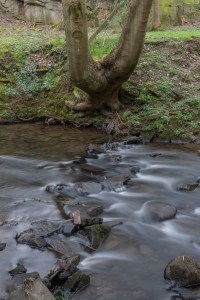
The Place
“Place” refers to vast open spaces and landscapes. It includes mainly nature photography but it can also include man-made structures and urban areas; it has a very broad and flexible definition. When photographing a landscape, cutting out the sky can change it from simple being “a view” to a landscape photograph – framing is important!
There are four main types of landscape:
- Natural landscape
- Urban landscape
- Social landscape (e.g street photography)
- Psychological or Emotional landscapes (inner landscapes)
Robert Adams, a landscape photographer, said that there are three main elements to photographing places: Geography, Autobiography and Metaphor. Taken together, they strengthen and reinforce each other and create a successful and powerful photograph.
Pre-17th Century, landscape was confined only to the backgrounds of other genres. But after the 18th Century, there were three types of landscape photography:
- The Sublime – awesome sights, nature at its most fearsome.
- The Beautiful/Pastoral – inhabited landscape, smooth and ordered.
- The Picturesque – ruins and incomplete buildings, gives an edgy feel.
Edward Burtynsky photographs manufactured and industrial landscapes, such as factories. He documents people and their place in relation to the world, and their impact on the environment. He photographs quarries and mines which document extraction in the landscape – begging the question “how long will our oils and fuels last if we continue?” He also photographs pollution, rubbish, recycling materials and landfill sites. Large factories are placed in our environment due to our consumer lifestyle; as humans, we use and dispose of things all the time. Man-made structures include roads, houses and cars which are also mass-produced and take a toll on the environment. However, Burtynsky wants to show that even industrial, urban or conventionally unattractive places can appear beautiful through a lens and the power of photography; landscapes don’t always have to be “beautiful” and “perfect.” His work is Post-New Topographics, the book of photographers that also photograph urban landscapes and focus on how humans are affecting and damaging the planet. He uses large format prints to capture every detail and make sure it’s visible.
Landscape photographers include:
- Ansel Adams
- Jitka Hanzlova
- Liza Dracup
- Albert Bierstadt
- Noemie Goudal
- Eugene Atget
- Bill Brandt
- Lewis Baltz
- Stephen Shore
- Bernd and Hilla Becher
- Joel Sternfeld
- Simon Roberts
- Rut Blees Luxemburg
- Edward Burtynsky
- Richard Mosse
- Ed Rusha