FINAL IMAGES – VISUAL DEVELOPMENT

Light and Shadow

This slideshow requires JavaScript.

I chose these images as my final 4 as they are by far the most effective images. The urban feel from the abandoned bus station and the black and white effect gives the images an interesting and mysterious feel to them, and the desaturation also makes the contrast between the light and shadows stand out. I also think these images have visual impact when you look at them for the above reasons.


Everyday Geometry

This slideshow requires JavaScript.

The reason I chose the above images for this assignment was because they are the most accurate of the images I have produced; it’s incredibly difficult to get these kind of images 100% perfect, but I feel that these are as close as it gets. I also really like the impact these images have from the bright coloured backgrounds which compliment the colours of the subjects themselves, thanks to using the colour wheel for reference. Biscuits are also a less obvious subject choice than fruit, and I feel that the variety in compositions compliment each other well.


Who’s Who

This slideshow requires JavaScript.

These images are my final 4 because the concept of “what makes us unique” got me really intrigued and I feel like my results were so successful because of this genuine interest in the concept. I also feel like the extreme close-ups provide a unique perspective to the assignment that other people may not have produced, as it is easy to look at this brief and take a standard, stereotypical “portrait” image of the person’s face and shoulders, and I wanted to produce something more bold and with a deeper meaning. I also think the black and white effect combined with the close-up composition make the images feel very intimate and beautiful to look at.


Printing these images was a difficult task to understand at first, but after I got the hang of it I really enjoyed seeing my images printed in a physical copy in front of me. I chose Permajet Matte paper in 285gsm and Royal Gloss in 310gsm to create a professional feeling thickness and quality to the paper, to avoid them being flimsy or low quality. I chose Matte paper for the Light and Shadow images as I felt like avoiding the glare from glossy papers would show up more of the details and shadows in the images more successfully. I then chose the Royal Gloss paper for Everyday Geometry so that the shiny, glossy effect would further make the bright colours stand out and really make them pop, and the same paper type for Who’s Who to give the black and white images an even more luxurious feel and make the intimate details on the subject’s face really stand out. I ensured that each set of 4 images was placed in the exact same place on each page to successfully communicate they are part of a set, and used a slightly different composition for each set to keep them separate from each other. I used a white border around the edges to frame them and make further use of the space on the page.
Biscuits Shoot – VISUAL DEVELOPMENT – Everyday Geometry

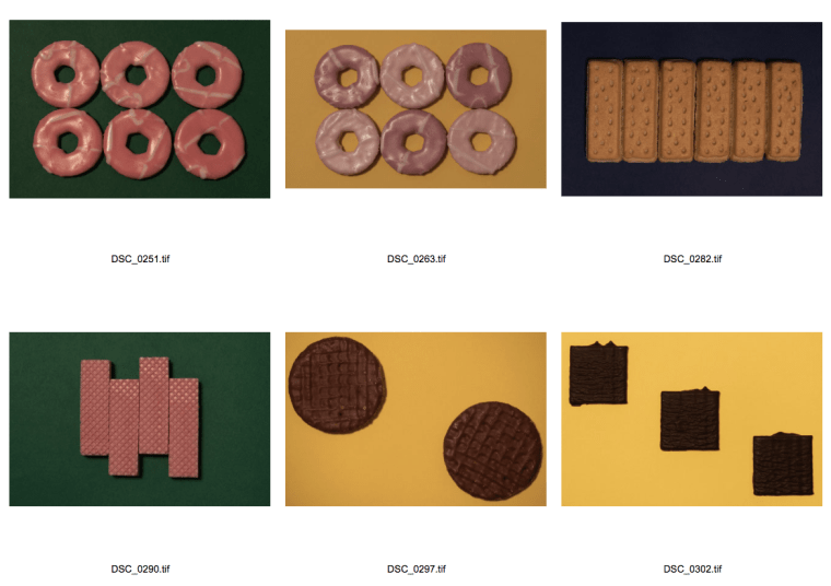
Biscuits and chocolates were my next subject idea for this assignment, as they aren’t organic and are mass produced and shaped by machinery, therefore I hoped that each individual item would be the same size and shape, eliminating some of the chances of inaccuracy. I searched the supermarket shelves to find a variety of interesting snacks that were also shaped geometrically and that I could envision would make effective compositions. Party Rings, Chocolate Rounds, Shortbreads, Pink Panthers, Chocolate Digestives and After Eight Mints were all chosen to be my subjects; the most challenging of them were the ones coated in chocolate, which always held the possibility of melting and left the occasional mark on the card I used in the background. It was great fun to experiment with compositions and arranging these delicious treats into eye-catching, novelty images that I think will form an interesting set as a group of 4, with similar subject matters carried across each image. Also, I took the feedback from the last tutorial into account and chose the coloured card in the background by referring to the colour wheel and using complementary colours to further make the images pop.

Here are the original images:

This slideshow requires JavaScript.


Next, I chose the most successful, accurate images and took them into Camera Raw and Photoshop to use the pipet tool to selectively choose individual areas of the images and change the Hue, Luminance and Saturation of the colours to really make the colourful backgrounds pop, and make the subject matter stand out from the background. I wanted these images to have high impact due to the bright colours and the novelty of using biscuits, with some nostalgic snacks from childhood in there such as the Party Rings and Pink Panther biscuits. These images are below:

Screen Shot 2018-12-09 at 23.58.55

Manchester Shoot – VISUAL DEVELOPMENT – Everyday Geometry & Who’s Who

This trip was originally planned with the intention to take more images for the Who’s Who assignment, outside of our scheduled workshops. Myself and 3 other students from the course decided to make a day trip into Manchester city centre, with the idea that asking strangers for a photograph would be easier in a larger and busier environment as nobody would know who we were, and we thought that this would make the process less daunting or embarrassing. However, despite my best efforts I was unfortunately still too anxious to approach people, as everyone was in a rush and too busy with their own lives and I found it too daunting to stop people and be an inconvenience to their day; I was also worried about how people would react to having their photo taken by a complete stranger. My fellow students also felt the same way.

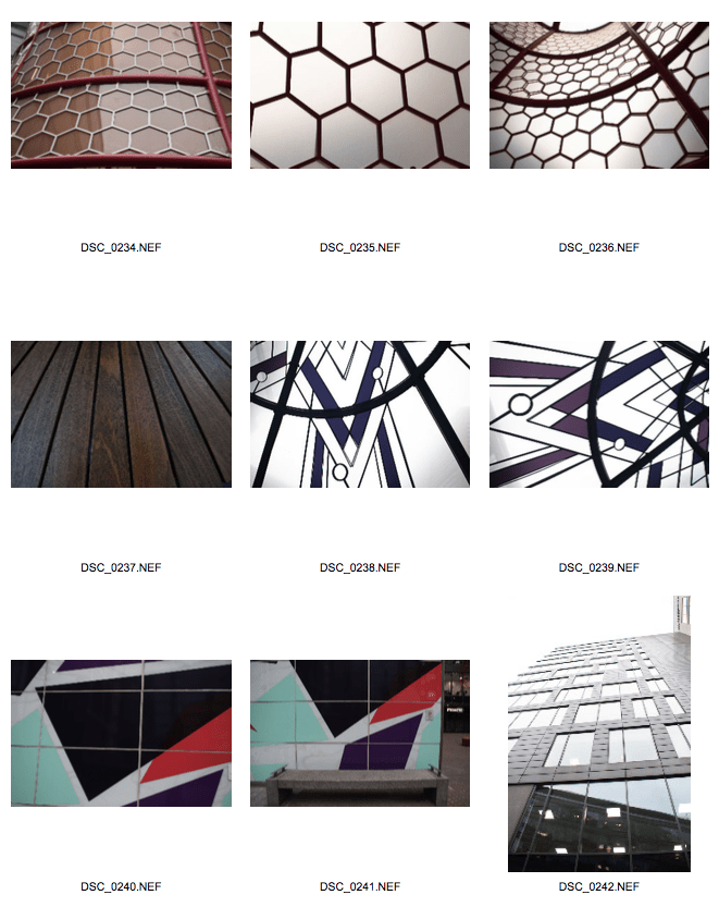
However, we still made the most of this trip and found many different examples of geometry and shapes for the Everyday Geometry assignment. This trip around the city really opened my eyes to the amount of shapes and geometrical patterns that surround us every day, many of them which we don’t even notice. Benches, buildings and installations on walls were all items that we found to have geometrical shapes and these images all greatly inspired me for this assignment. Although I won’t use these images as my final pieces as they aren’t all flat lay or my own unique compositions, they have still influenced my thoughts and the direction I will take with this assignment.

Screen Shot 2018-12-09 at 23.17.32

Screen Shot 2018-12-09 at 23.17.44

Pencils Shoot – VISUAL DEVELOPMENT – Everyday Geometry

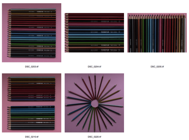
After experimenting with organic matter with the fruit from the last Geometry shoot, I decided to try using a different type of everyday item to photograph. Pencils are used by most people everyday and are mass produced in a sturdy material like wood, which means that each pencil in a new pack should be the same shape and size and they are easier to arrange and compose. I arranged the pencils on some baby pink card that contrasted very effectively against the colours of the pencils. I placed them in the same order that they appeared in the original packaging, to keep them in the order of the rainbow which creates a sense of order in the photograph. Then, I photographed them from varying focal lengths and changed the composition to create variety in my images.

Below are some contact sheets of the original images from this shoot:

This slideshow requires JavaScript.


I also took inspiration from Sakir Gökçebag’s images; in particular I tried recreating his image of the watermelon slices arranged in a circle by arranging my pencils in a circle, too, as both of them give an interesting “spiky” kind of texture to the image. Below is a comparison of Gökçebag’s image (left) next to one of my images (right):

Gokcebag watermelon circle  DSC_0220


Many of the images are underexposed and dark as I photographed them just before the sun was setting and I was losing light fast. I took the images into Camera Raw and Photoshop to try and brighten the images and exposure, and also add Lens Corrections to remove any weird curving and distortion of the images. The best images are below:

Screen Shot 2018-12-09 at 22.44.51


UPDATE: 23/11/2018

After the group tutorial today, I was given feedback on these images. My peers said that these images are more effective than those from the fruit photoshoot, however they aren’t yet “perfect” as the pencils are aligned slightly wonky and aren’t immaculately straight, whereas geometry is all about “perfection” and accuracy. Another thing that was pointed out was that the pencils aren’t all facing upwards with the writing facing the camera, therefore it would be even more effective and pleasing to look at if the images were retaken with the writing facing the same way, ensuring the pencils were even more uniform. I may retake these images if I have time, but first I will continue exploring new ideas and undertake a photoshoot with biscuits and similar items, as I feel like this will create an effective set of images, whereas it would be harder to create 4 interesting images with this single media.

Fruit Shoot – VISUAL DEVELOPMENT – Everyday Geometry

Taking inspiration from Sakir Gökçebag, I decided to experiment with photographing fruit for the Everyday Geometry assignment. I decided it would be best to use lemons, limes and kiwis, as these fruits are already quite round in shape, and I find that circles are a pleasing and calming shape as there are no sharp corners; they also have intriguing natural shapes inside them when they are sliced, such as triangles and the unusual shapes and seeds inside a kiwi fruit are particularly unique. Next, I bought a few different coloured pieces of card that I thought would contrast well against the chosen fruits, in colours such as yellow, green and orange. I tested out the most successful colour combinations between background and subject, and found that the green of the kiwis contrasted very effectively against the bright orange card. I also inverted the colours between the lemons and limes, using yellow card for the limes, and green card for the lemons. I sliced the fruit into circular slices and arranged them in various different compositions to find the most effective ones. At the end of my shoot, I found cutting these slices in half and forming triangular shapes was also effective, although I think I prefer the impact of the larger round slices.

Here is a slideshow of the original shots from this shoot:

This slideshow requires JavaScript.


Next, I chose the most successful images and edited them in Camera Raw to enable Lens Corrections which removed any slight curving at the edges, adjusted the exposure as the images were quite dark and underexposed, and used Photoshop to remove some of the markings on the card or slight imperfections in the fruit. This was the result:

This slideshow requires JavaScript.


UPDATE: 23/11/18

Today, we had an informal tutorial to present and discuss our images with our peers. I was given positive and constructive criticism from both my tutor and peers, such as: the simpler compositions such as “DSC_0156.tif” prompted a smile and created a calming, pleasurable effect as the round shapes and arranging the fruit in a line gives a sense of order. As fruit is organic matter, no two pieces of fruit are shaped exactly identically, therefore some imperfections and differences can be seen in the images, and I was told this takes away from the idea of “perfection and accuracy” in geometry; similarly, arranging the subjects freehand gave imperfect compositions and therefore I was advised to be more accurate when reshooting the images, such as drawing markings on the card and using a ruler to create identical spaces between objects. Then, I communicated my troubles with inconsistent lighting and shadows, and was advised to stand the subjects on bottle top lids to lift them further away from the card and reduce the shadows. Lastly, I was advised when choosing the colour for the card in the background, to look at the colour wheel and use complementary colours to show thought and consideration for the choice of background.

From this feedback, I have decided to do another shoot but this time using biscuits and sweets, as these are mass produced using machinery and will hopefully provide more identical subjects; I will also use rulers to more accurately place the items when composing the images, and hopefully both of these things will help produce more accurate and “perfect” geometrical images. I will also look at the colour wheel when choosing the right background, using opposite colours every time, showing my understanding of this important concept in art and design.

Sakir Gökçebag – RESEARCH – Everyday Geometry

Born in 1965 in Denizli, Sakir Gökçebag is a Turkish photographer and installation artist. In 1987 he graduated from the Faculty of Fine Art at Marmara University; he then went on to complete his masters degree 1990 and his doctoral degree in 1994. He has taken part in many group exhibitions in Turkey and abroad, as well as many of his own solo exhibitions. In 1991, Gökçebag won the second prize in the State Painting and Sculpture Competition in Ankara. He was also awarded the Markus Lüpertz Prize by Düsseldorf Academy in 1996.

In particular, Gökçebag’s geometric food art inspires me for the Everyday Geometry project. One of my initial ideas was to use fruit for this project, and viewing this photographer’s work has shown me how successful, unique images can be made even with quite simplistic objects. He arranges and organises various fruits and vegetables into striking patterns and displays, without the use of digital manipulation. This has encouraged me to produce geometric shapes in the “real world” without relying on Photoshop or other digital manipulation software, which can be very tempting to do in the digital age. This will also give a more authentic feel to my images.

Pinterest Boards – RESEARCH

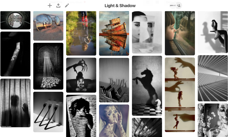
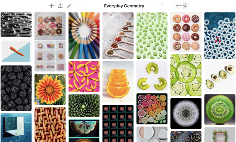
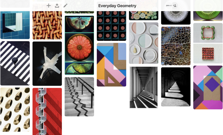
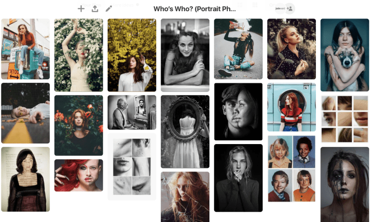
To help inspire me and generate some more ideas for my assignments, I took to Pinterest to look at other people’s photos that may positively influence my work. I have saved a wide variety of examples for each assignment to look at whenever I need motivation and ideas. Pinterest is a very creative platform, therefore I chose this website to create my mood boards because it is most effective at helping me generate creative thoughts, with the added bonus that there are useful articles attached to some of the images with handy photography tips, such as successful poses for portrait photography.


Light and Shadow

Screen Shot 2018-11-18 at 20.24.09

I find the images of buildings and fences on this board very interesting and they are similar to the work I produced in my previous photoshoot for the Light and Shadow assignment in Hanley in the abandoned bus station. Moving forward, I also find the images with reflections very intriguing and this was one of my initial thoughts for this project. I may take this direction next and see how successful the outcome is. Reflections can be found in many places such as bodies of water, windows and reflective surfaces such as the pair of glasses above. I also like the idea of the shadows on the wall which interact with the physical subjects in the images above, such as the woman watching the scary movie on the sofa.


Everyday Geometry

Screen Shot 2018-11-18 at 20.25.08

Screen Shot 2018-11-18 at 20.25.38

I found a lot of inspiration for this assignment as I was particularly struggling to find ideas for what to photograph, due to the 2cm height limit for the images and the flat lay style. From this research, I have decided to separately photograph slices of fruit, some pencils and some biscuits that will all be below 2cm and will be placed on coloured card to create an aesthetically pleasing background, especially when the colour of the subjects contrast against them. The items themselves will be shaped geometrically, but I will also arrange them in other shapes to further carry the theme through the images. Fruit is particularly interesting because there are natural shapes hidden within them, such as inside kiwis, lemons and limes. I was also inspired to look for more geometric shapes around me within daily life, such as buildings and in the objects we use around the house daily.


Who’s Who?

Screen Shot 2018-11-18 at 20.30.01

This mood board is a mixture of aesthetically pleasing images and ones that hold a deeper meaning, such as the old gentleman looking into the mirror with the reflection of his younger self. I like the idea of having a deep meaning behind my images, as I would like to use photography to communicate ideas and get people thinking. However I also like the idea of not having to include any deeper meaning, and simply produce images because they look nice. I think adding a deeper meaning to my images may be more difficult for this assignment as I am required to photograph people I don’t know, and therefore I don’t know their stories. I am initially very nervous and shy about approaching people, so I will experiment with taking simple, pretty images and see how much my confidence grows. Very effective images can still be made, simply by using an effective background or location.

Conkers – VISUAL DEVELOPMENT – Everyday Geometry

The Everyday Geometry assignment seems like a challenging assignment. Starting from the beginning and to experiment with the camera and my ideas, I found some conkers on an autumnal walk and decided to photograph them arranged in different geometric shapes. The conkers themselves are shaped closely like circles or spheres, with each one being unique as no conker is formed the same. Arranging a handful of these conkers into other geometric shapes further communicates the intention of the assignment. Also, conkers can be nostalgic as they bring back memories of conker picking and battles as a child, which most people can relate to, therefore adding another meaning to the image.

Here are my results:

Screen Shot 2018-10-29 at 18.11.04

Hanley Photoshoot – VISUAL DEVELOPMENT – Light and Shadow & Everyday Geometry

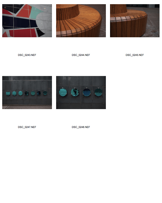
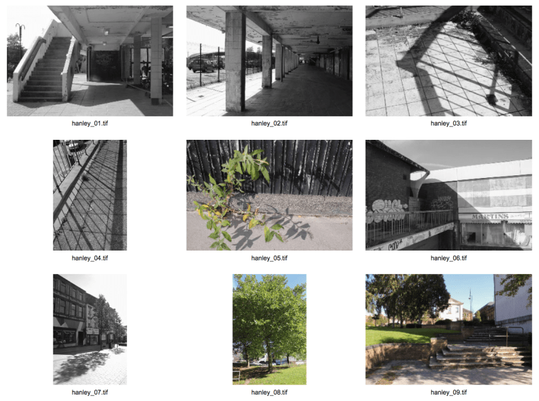
On 25/09/18 I ventured into Hanley town centre with one of my fellow students to embark on our first photoshoot for these assignments. The main purpose of this trip was to experiment and get used to our cameras, look for some initial ideas and create some initial images. It was very sunny on this day which was particularly perfect for the Light and Shadow assignment. We began our photographic journey at the old abandoned bus station; this area had a mysterious ‘urban’ atmosphere which intrigued me, and the buildings and railings casted many shadows that attracted my photographic eye. Some of the graffiti was also very eye-catching and I enjoyed experimenting and capturing this artwork with my camera. Next, we walked around the town centre and captured more interesting shadows; I also spotted many different geometric shapes that inspired me for the Everyday Geometry assignment, and so I took the opportunity to photograph these for some initial ideas. I was surprised how many geometric shapes and patterns can be found in everyday places and situations (e.g. the brick road in ‘Hanley_31.jpg’ and the windows on the office building in ‘Hanley_42.jpg.’ I feel that this has really opened my eyes to the possibilities for this assignment.

Below is a slideshow of the contact sheets I produced for this photoshoot:

This slideshow requires JavaScript.


UPDATE: 25/10/18

After completing a computer workshop with Mark, I decided to put the editing techniques I had learnt into practice. I chose my favourite images from this shoot, and opened them up in Camera Raw to adjust them. This can be done by altering the Histogram in the top right corner, which gives you a visual indication of the Highlights, Mid-tones and Shadows in the image. I also adjusted the sliders on the right hand side to adjust elements of the images such as Temperature, Tint, Exposure and Contrast. I chose to change the Treatment to Black and White for most of the images, as I feel that this effectively brings out the areas of light and shadow and draws the viewer’s attention to these areas, which is important for the Light and Shadow assignment.


Below is a contact sheet of the final edited images from this shoot:

(Light and Shadow assignment)

Screen Shot 2018-10-29 at 17.40.48

Ernst Haas – RESEARCH – Everyday Geometry

Ernst Haas was born in 1921 in Vienna, and is known as “one of the most celebrated and influential photographers of the 20th century.” He first took up photography after the war, and was recognised by LIFE magazine thanks to his early work on Austrian returning prisoners of war. In order to keep his independence, he declined a job offer as a staff photographer; he then went on to develop close associations with high profile photographers such as Henri Cartier-Bresson, when he joined Magnum in 1949.

Shortly after moving to the United States in 1951, he began photographing in black and white in the New Mexico desert, where he developed a great desire for colour. He then began experimenting with Kodachrome colour film, and would later become the premier colour photographer of the 1950s! His ground-breaking 24-page colour photo essay on New York City was published by LIFE magazine in 1953, which was the first time such a large colour photo feature was published in the magazine. It is said that “before Haas there was no colour photography, only coloured photographs.” He photographed for many influential publications such as Vogue, LIFE and Look, travelling extensively throughout his career. He also authored four books: The Creation (1971), In America (1975), In Germany (1976), and Himalayan Pilgrimage (1978).

Haas received the Hasselblad award in 1986, the year of his death, and has continued to be the subject of many museum exhibitions and books, such as the quite recent publication Color Correction in 2011. His legacy continues thanks to The Ernst Haas Studio, located in New York, which helps to aid researchers and oversees all projects related to his work.


Below is a quote by Haas which I find inspirational:

“There is no formula – only man with his conscience speaking, writing and singing in the new hieroglyphic language of light and time.”

Ernst Haas

I interpret this quote as him saying that there is no “magical formula” in photography; we, as photographers and people, can only express our feelings and emotions in this medium, which he describes as a language of pictures (hieroglyphics), made up of light and a particular moment in time.


Some examples of Haas’ work that inspire me for the “Everyday Geometry” project include: