Light and Shadow
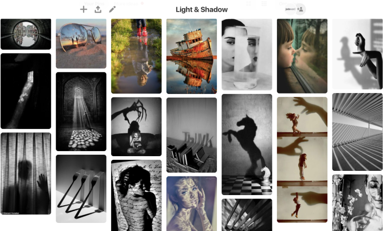
I chose these images as my final 4 as they are by far the most effective images. The urban feel from the abandoned bus station and the black and white effect gives the images an interesting and mysterious feel to them, and the desaturation also makes the contrast between the light and shadows stand out. I also think these images have visual impact when you look at them for the above reasons.
Everyday Geometry
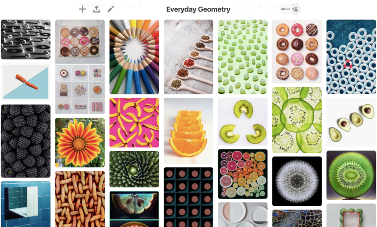
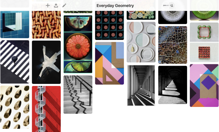
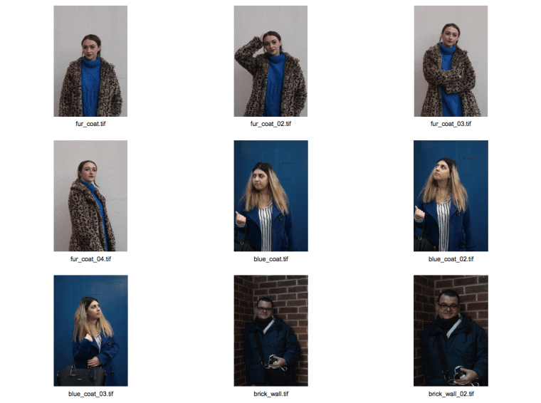
The reason I chose the above images for this assignment was because they are the most accurate of the images I have produced; it’s incredibly difficult to get these kind of images 100% perfect, but I feel that these are as close as it gets. I also really like the impact these images have from the bright coloured backgrounds which compliment the colours of the subjects themselves, thanks to using the colour wheel for reference. Biscuits are also a less obvious subject choice than fruit, and I feel that the variety in compositions compliment each other well.
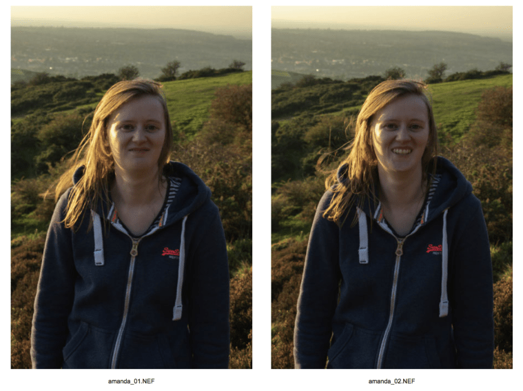
Who’s Who
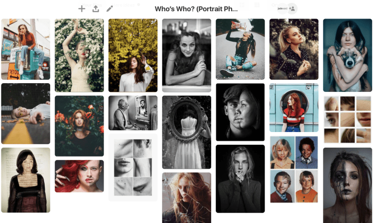
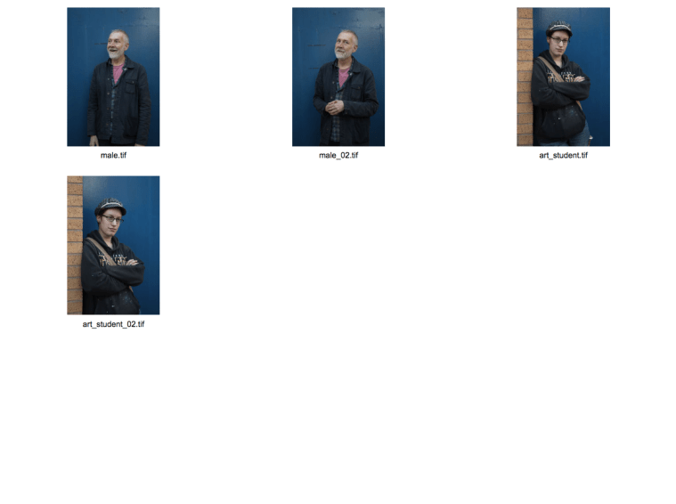
These images are my final 4 because the concept of “what makes us unique” got me really intrigued and I feel like my results were so successful because of this genuine interest in the concept. I also feel like the extreme close-ups provide a unique perspective to the assignment that other people may not have produced, as it is easy to look at this brief and take a standard, stereotypical “portrait” image of the person’s face and shoulders, and I wanted to produce something more bold and with a deeper meaning. I also think the black and white effect combined with the close-up composition make the images feel very intimate and beautiful to look at.
Printing these images was a difficult task to understand at first, but after I got the hang of it I really enjoyed seeing my images printed in a physical copy in front of me. I chose Permajet Matte paper in 285gsm and Royal Gloss in 310gsm to create a professional feeling thickness and quality to the paper, to avoid them being flimsy or low quality. I chose Matte paper for the Light and Shadow images as I felt like avoiding the glare from glossy papers would show up more of the details and shadows in the images more successfully. I then chose the Royal Gloss paper for Everyday Geometry so that the shiny, glossy effect would further make the bright colours stand out and really make them pop, and the same paper type for Who’s Who to give the black and white images an even more luxurious feel and make the intimate details on the subject’s face really stand out. I ensured that each set of 4 images was placed in the exact same place on each page to successfully communicate they are part of a set, and used a slightly different composition for each set to keep them separate from each other. I used a white border around the edges to frame them and make further use of the space on the page.